
Ideas on experience, made useful.
Notes on the evolving UX landscape — from AI's impact on design to inclusive strategy and accessibility. Longer pieces appear on UX Planet, Fast Company and Medium.
Latest articles
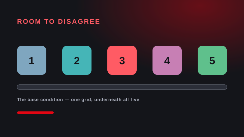
Room to Disagree
A framework for designing and testing the interfaces through which people oversee AI systems. Five capabilities mapped to Article 14(4) of the AI Act, one condition underneath all five, and a behavioural test that measures whether the oversight you have documented actually happens.
Why accessibility overlays are now a bigger legal risk than doing nothing
Overlay widgets promise compliance in one line of JavaScript. The evidence points the other way — they attract complaints, and they make the underlying problems harder to find.
Nobody buys an accessibility audit. They buy the report.
The testing is the easy part. What clients actually pay for is a document their team can act on — and that is where most audits fall down.

GEO just became a budget line describing accessibility
Structured, machine-readable content is what AI engines cite. It is also, almost line for line, what accessibility has been asking teams to do for years.
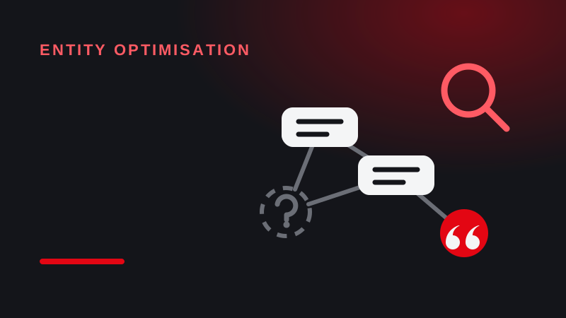
The machines can’t cite what they can’t identify
AI engines cite what they can name with confidence. If your content doesn’t make its entities explicit, it doesn’t get quoted — however good it is.

The EAA, one year on: enforcement arrived — just not from who you expected
Twelve months after the deadline, most of the pressure is not coming from regulators. It is coming from procurement, customers and competitors.
Πρόστιμα EAA στην Ελλάδα: τι λέει πραγματικά ο ν. 4994/2022
Ποιος ελέγχει τι, γιατί το άρθρο 26 δεν αναφέρει κανένα ποσό και τι εκθέτει πραγματικά τα e-shops και τις επιχειρήσεις.
What most teams misunderstand about the European Accessibility Act
A few alt-text fixes don't make you compliant. What the EAA actually asks of digital teams — and how to get ready.
Accessibility debt and hidden costs
How delaying inclusive design quietly erodes product quality, user trust and revenue — and what it costs to catch up.
How to run a UX audit in under 2 hours
A practical, repeatable process for designers who want a fast, no-fluff way to evaluate a product and prioritise fixes.

Why design systems are the only investment that gets cheaper as AI gets smarter
After 18 years and six enterprise rollouts, why design systems are a smarter bet than ever in the age of AI.
The myth of the “average user”
We keep designing for someone who doesn't actually exist. A case for designing to the edges instead of the mythical average.
I built a Figma plugin to audit my own team's work
What 235 unnamed layers taught me about the gap between having design standards and actually keeping them.
Read more long-form writing on Matthaios's channels.
Have a project in mind?
Let's turn these ideas into an experience your users will thank you for.
Start a project